|
Comments welcome : charlie@davenportstation.org.uk |
The Altfelden pages are devoted to my unhealthy obsession with all things relating to Austrian railway branch lines of the 1990s - even unto the present day - and my little model railway 'Altfelden' which tries to recreate the happy days I have spent visiting and travelling on these lines. I hope they will be of interest, especially to my friends in the Austrian Railway Group. - Charlie Hulme,
Contributions by ARG members
From Stephen Ford: I have been using the font Helvetica 65SE. I am advised that all the versions were available from the sign manufacturing plants of ÖBB. The "type 2" were introduced with the "type 1", and I am advised
by an ÖBB staff member that both are still available, but only to special order. I am also advised that when new cutting equipment was bought in 1992, this had the ability to cut signs to length - previously the blanks were made to a set of standard patterns (in response to the need to make standard-length signs in plastic for the
signs, such as that at Wien Nord, which are internally illuminated).
The left-justify is the original type, but both centre and left-justification has been one of the choices when ordering replacement signs. Incidentally, stations are supposed to keep spares. Unmanned station names are kept at the nearest manned station.
Stations which have been refurbished - or newly built - since 2003 (?) have been fitted with new, square-ended signs, in a deeper blue, and using a different font. Curiously, instead of the signs being different sizes, I have now come across signs with different-sized fonts!
The station signs I made for the ARG were originally measured from samples bought by a member ... my drawings from them show gross measurements of 1,340mm by 330 / 332 mm (the difference in two sets of signs). These
are for the "standard" not the "longer" or "longest" signs - there appear to be three standard lengths, and two depths.
From Gerhard Urban: Ron Ferguson and I had a decent look at the Alt Nagelberg station sign on the Waldviertelbahn in February 2007. We put the measuring tape to the original station sign provided by ÖBB in 1986, a few months before regular passenger services were withdrawn at the end of May.
Here what we found:
allover length: 1.586 mm
allover height: 329 mm
distance between corner of the board and the white line: 29 mm
thickness of white line: 10 mm
Font: Helvetica
Font size "N" character: 130 mm high
legend "Alt Nagelberg" centered
.
Österreichische Bundesbahn station name gallery
This page arose from my interest in trying to get my model railway correct for the early 1990s period.
I've added (February 2007 - left column) some comments and enhancements kindly contributed by members of the Austrian Railway Group.
I had noticed that the type of station nameboard in use in Austria at the time, which seems to have appeared as a standard about the same time as the rest of the corporate image, circa 1980. However, it seemed to me that the style of the sign had varied over the years, and that there are three basic styles in use:
1. Name left-justified, with space to the right
2. Name centred, space both ends
3. Sign fitted to length of name, with only minimal space each end.
Type 3 seemed to me to be a recent development (although I'm told that left-justified versions can be made on request), but when I asked about this on the ARG mailing list, nobody seemed to really know, so I trawled through my own pictures, some I found on the Web, and pictures in books, to see if I could put styles to dates. I haven't asked anyone's permission to use parts of their picture, nor have I given any credits: if you recognise your picture and object to this, then please tell me. Otherwise, thanks for your help!
I must emphasise that the statements on this page might well be total nonsense. If you know they are, please tell me - the address is info@nwrail.org.uk
I've grouped the pictures by year: the earliest I could locate in my collection were from 1989....
1989
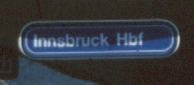
Innsbruck station: the classic left-justified item.
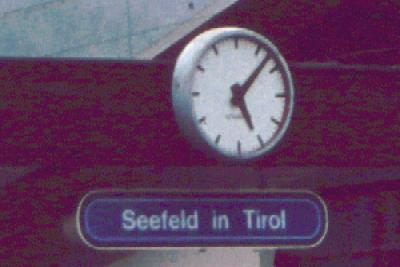
Also 1989, but type 2 centred at Seefeld. Why the difference?
1992
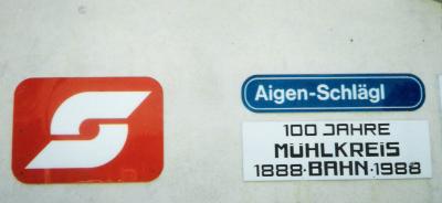
My biggest inspiration, the Mühlkreisbahn as I found it in 1992. Type 1 at Aigen-Schlägl.
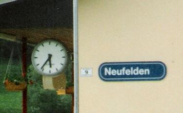
Same line, and Neufelden. I believe the line was given a major makeover in the early 1980s, so perhaps the signs date from then. So, I conclude that my use of a left-justified sign on my Altfelden model (see index page) is, er, justified!
1993
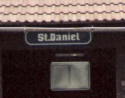
St.Daniel halt on the Gailtal line: quirky hand-painted example, but note the space each side.
1994
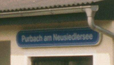
Purbach am Neuseiedlersee: possibly type 2 but the name is so long anyway...
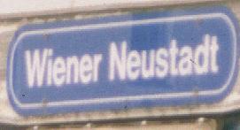
Wiener Neustadt: type 3.
1995
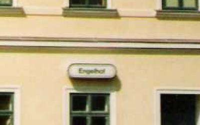
Engelhof. This station on the Gmunden Seebahnhof branch is said to be the oldest station building in the country, and was given a controversial facelift in the (?)1980s. Type 2 layout, comnided with what I believe to be a special black-on-white design for use on particularly historic structures. Rekawinkel station also has this style: any others?
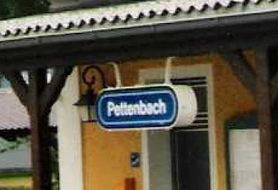
Pettenbach, on the narrow-gauge Pinzgau line. Showing the depth of the illumibated version of these signs. Type3, and looking quite new in 1995.
1996
The Krimml line again - but spaces each end, defintely type 2. Mounted on two posts.
2002
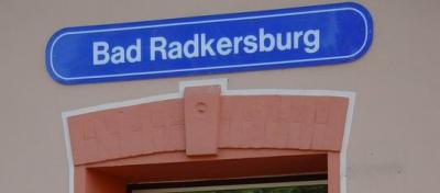
Bad Radkersburg: Type 2 again.
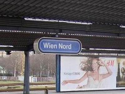
Wien Nord: illuminated version of Type 1.
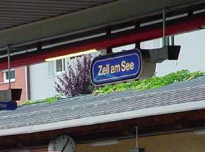
Zell am See. This station had recently been rebuilt, and the sign is a Type 3.
2003
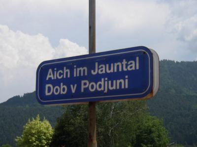
Interesting German - Slovene bilingual sign at Aich im Jauntal. Left-justified on the second line.
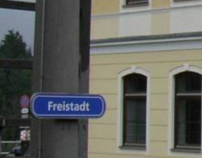
Freistadt, Linz - Summerau line. Type 2.
2004
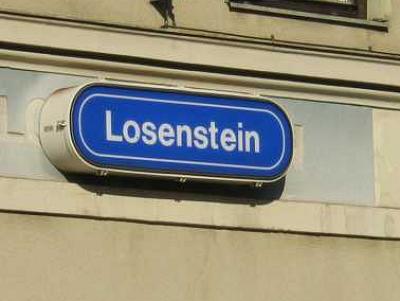
Losenstein: this illuminated sign looks more or less brand-new in 2004, suggesting that type 3 was the last version.
2005
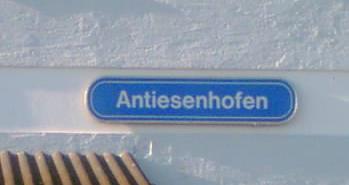
Antiesenhofen, near Schärding. Type 2. Quite light colour, faded in the sun, or is it my phone-camera?
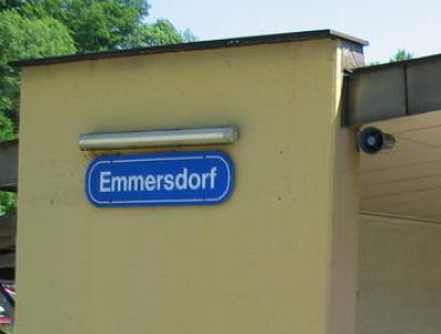
Emmerdorf. Type 3.
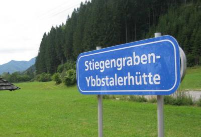
Very long name in two lines on the Ybbstal line.
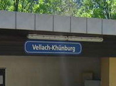
Vellach-Khünburg
2006 - change of style
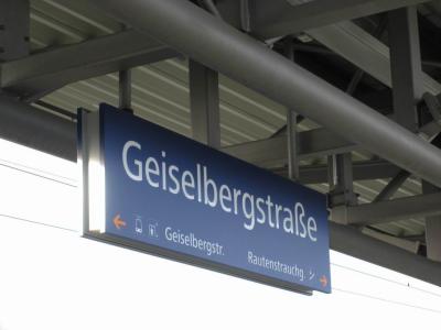
Gieselbergstrasse: A totally different style featuring a new typeface, which is being used for all new work, to match the ÖBB's new logo. Let's call this one Type 4.
Back to the Altfelden index
Page by Charlie Hulme, February 2007. Revised September 2016.